A newly revised phylogenetic tree depiction that incorporates experimental infection information from Highly Pathogenic Avian Influenza challenge studies. A 5 minute read.
My PI, Dr. Nichola Hill, approached me about this recent paper (Gonnerman et al., n.d.) that came out titled “A systematic review of laboratory investigations into the pathogenesis of avian influenza viruses in wild avifauna of North America”. The head author of this paper is one of our collaborators and for a flu researcher like myself this is an amazing resource. If you look at the paper, table 1 is a gold mine of information, including ‘mortality rates’, ‘infection rates’ and ‘number of birds infected’! If you have read my other blog post (here), you might remember that one of the missing things from that analysis was the numerator of how many birds were sampled. While this still does not solve that issue, it gives us a way to compare the field observation data with the lab/experimental data.
Nichola asked me if I could marry these two datasets into a updated “mortality tree”. This blog post will do just that, so without further adu let’s get into it. Note: If you are less interested in the coding involved in the creation of this plot feel free to click the sidebar links to go straight to the “final plot” section where you can see the tree and read my thoughts.
A Phytools Update:
It is worth noting that Dr. Liam Revell, the developer of phytools, just added a new function to allow for plotting trees with “traits” on them which is great. Previously we had to do some special plotting to make it work but Liam rolled that into this function.
The Data:
First let’s pull in the digitized data from the Gonnerman paper. I have hid the packages used but they are the same as in this prior post.
head(maryland_data,n=3) |> knitr::kable()
species
studies
sampled
infected
infection_rate
mortality
mortality_rate
com.name
order
family
type
avonet.name
phasianus_colchicus
phasianus_colchicus
2
20
20
1
20
1
ring-necked pheasant
galliformes
phasianidae (pheasants, grouse, and allies)
Other
phasianus_colchicus
cygnus_buccinator
cygnus_buccinator
1
5
5
1
5
1
trumpeter swan
anseriformes
anatidae (ducks, geese, and waterfowl)
Goose/Swan
cygnus_buccinator
cygnus_olor
cygnus_olor
2
7
7
1
7
1
mute swan
anseriformes
anatidae (ducks, geese, and waterfowl)
Goose/Swan
cygnus_olor
Let’s also bring in our “contMap” object, again from the prior post and the USDA observational data. Remember that a contMap object is just a tree that we have performed ancestral state estimation to obtain the value of the trait at the internal node of the tree. Then we have interpolated the state of the trait along the edge of the branches. You can read more about this object type using ?contMap. In addition we are going to change the color scheme to “plasma” again and ladderize the tree to make it look nice.
#read in treemort_cMap <-readRDS(file ="/Users/jonathandain/My_Files/My_Code/Phytools_Workshop_2024/Plotting_Mortality_on_bird_trees/data/mort_cMap_base.rds")#make the color scheme plasma like we did in the other post. mort_cMap <-setMap(x = mort_cMap,colors=rev(hcl.colors(n =25,palette ='Plasma')))#ladderise the tree to make it "clean" lookingmort_cMap$tree <-ladderize.simmap(mort_cMap$tree)#read in USDA observational datad.trait <-readRDS(file ="/Users/jonathandain/My_Files/My_Code/Phytools_Workshop_2024/Plotting_Mortality_on_bird_trees/data/d.trait.clean_20240328.rds")
Making a joint dataframe:
We need these two datasets to actually talk to one another before we can begin to plot them.
First we need to trim down the maryland data to just the avonet name, # sampled, infection rate, and mortality rate.
Now we need to write a for loop that goes through our USDA trait dataframe and add in the experimental infection data.
## add in some new columnsd.trait |>mutate(MD_sampled="NA",MD_infection="NA",MD_mortality="NA")-> d.trait# add in the experimental datafor (i in1:nrow(d.trait)){ taxa <- d.trait$avonet.name[i] taxaif (taxa %in% maryland_data$avonet.name){ y <-which(maryland_data==taxa) y d.trait$MD_sampled[i] <- maryland_data$sampled[y] d.trait$MD_infection[i] <- maryland_data$infection_rate[y] d.trait$MD_mortality[i] <- maryland_data$mortality_rate[y] }}
We also want the birds that lack experimental data to have zero’s so we can plot them later on. Let’s do that below.
## Make the NA's zero and pull out the names to checkd.trait |>mutate(MD_sampled=ifelse(MD_sampled=="NA",yes='0',MD_sampled),MD_infection=ifelse(MD_infection=="NA",yes='0',MD_infection),MD_mortality=ifelse(MD_mortality=="NA",yes='0',MD_mortality)) |>mutate(MD_sampled=as.numeric(MD_sampled),MD_infection=as.numeric(MD_infection),MD_mortality=as.numeric(MD_mortality)) |>filter(MD_sampled!=0) |>pull(avonet.name) |>unique()->t1 #names in the USDA dataunique(maryland_data$avonet.name) -> t2 #names in the Lab data t2[c(which(t2%in%t1==FALSE))] #check which are missing.
[1] "melanitta_perspicillata" "columba_livia"
Looks like the surf scoter and the rock dove are not in my USDA data set. For now we will continue on rather than remaking the entire cont_map tree for the moment. So let’s finall change those NA’s to zeros.
#finish making the NA's zerosd.trait |>mutate(MD_sampled=ifelse(MD_sampled=="NA",yes='0',MD_sampled),MD_infection=ifelse(MD_infection=="NA",yes='0',MD_infection),MD_mortality=ifelse(MD_mortality=="NA",yes='0',MD_mortality)) |>mutate(MD_sampled=as.numeric(MD_sampled),MD_infection=as.numeric(MD_infection),MD_mortality=as.numeric(MD_mortality)) -> d.traithead(d.trait,n=4) |> knitr::kable()
sci.name
symptomatic
alive
total_cases
tolerance
mortality
avonet.name
type
order
family
MD_sampled
MD_infection
MD_mortality
dromaius novaehollandiae
1
0
1
0
1
dromaius_novaehollandiae
Other
casuariiformes
casuariidae (cassowaries and emu)
0
0
0
rhea americana
1
0
1
0
1
rhea_americana
Other
rheiformes
rheidae (rheas)
0
0
0
callipepla californica
6
0
6
0
1
callipepla_californica
Other
galliformes
Odontophoridae (quail)
0
0
0
meleagris gallopavo
18
0
18
0
1
meleagris_gallopavo
Other
galliformes
phasianidae (pheasants, grouse, and allies)
0
0
0
That looks great! Finally the last thing we need to do before plotting is to make sure the dataframe and our tree tips are in the same order.
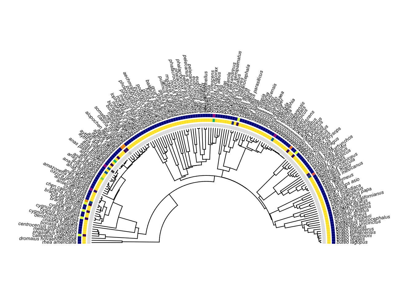
Ok now armed with our new dataframe and the new phytools function plotFanTree.wTraits() we can make a nice plot.
## Make a lost of colors## The first is our sample size## second is our "percent infected"## third is our "percent mortality"colors <-list(rev(hcl.colors(n =20,palette ="Light Grays")),rev(hcl.colors(n=20,palette ="Viridis")),hcl.colors(n=20,palette ="Plasma"))## Make sure the dataframe is a dataframe not tibbleas.data.frame(d.trait) -> d.traitrownames(d.trait) <- d.trait$avonet.name## Plot the tree!!!plotFanTree.wTraits(tree =ladderize(mort_cMap$tree),X = d.trait[,c("MD_sampled","MD_infection", "MD_mortality")],colors=colors,type="arc",part=0.50,ftype="i")
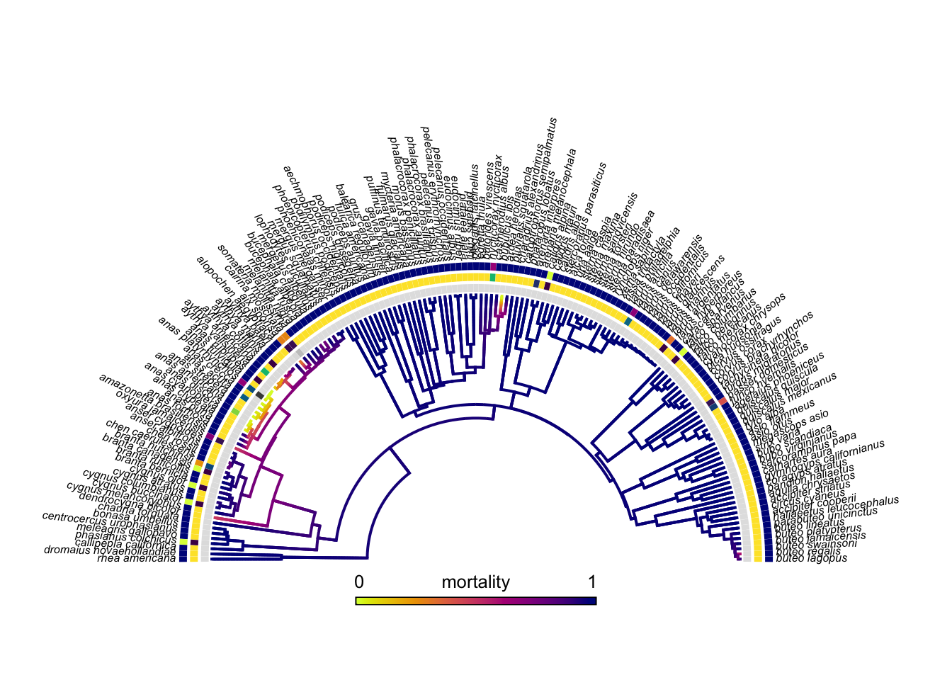
Wow that looks nice but what about our fancy colored tree -the scientific term for a contMap object. Well we need to overlay that onto this tree so we are going to use the x/y coordinates of this tree and plot the contMap object on top of this plot. Like so….
# plot the treeplotFanTree.wTraits(tree =ladderize(mort_cMap$tree),X = d.trait[,c("MD_sampled","MD_infection", "MD_mortality")],colors=colors,type="arc",part=0.50,ftype="i")# get the x/y coordspp<-get("last_plot.phylo",envir=.PlotPhyloEnv)# overlay the contMap objectplot(mort_cMap$tree,mort_cMap$cols,type="arc",add=TRUE,ftype="off",xlim=pp$x.lim,ylim=pp$y.lim,part=0.5,arc_height=0.7)# add in a color barh<-max(nodeHeights(mort_cMap$tree)) #get positioning for color baradd.color.bar(1.5*h,cols=mort_cMap$cols,prompt=FALSE,x=-(1.5*h)/2,y=-30,lims=mort_cMap$lims,title="mortality",subtitle="",fsize=0.8)
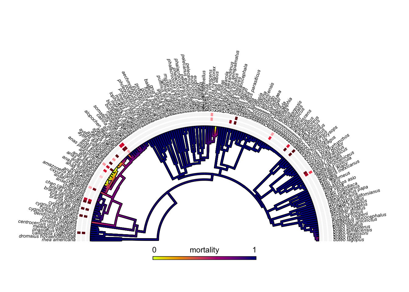
Ohh thats nice but what if we wanted to make the color scheme nicer. Maybe something like the Reds 3 palette for the experimental data.
## New color schemecolors <-list(rev(hcl.colors(n =20,palette ="Reds 3")),rev(hcl.colors(n=20,palette ="Reds 3")),rev(hcl.colors(n=20,palette ="Reds 3")))plotFanTree.wTraits(tree =ladderize(mort_cMap$tree),X = d.trait[,c("MD_sampled","MD_infection", "MD_mortality")],colors=colors,type="arc",part=0.50,ftype="i")pp<-get("last_plot.phylo",envir=.PlotPhyloEnv)plot(mort_cMap$tree,mort_cMap$cols,type="arc",add=TRUE,ftype="off",xlim=pp$x.lim,ylim=pp$y.lim,part=0.5,arc_height=0.7,outline=T)h<-max(nodeHeights(mort_cMap$tree)) add.color.bar(1.5*h,cols=mort_cMap$cols,prompt=FALSE,x=-(1.5*h)/2,y=-30,lims=mort_cMap$lims,title="mortality",subtitle="",fsize=0.8)
Ok I like this but there is actually a problem here. Look at branta canadiensis for example, do you see how it has the outside most “tip trait” as filled but then it looks like there is nothing in the innermost “tip trait”. That is because the value for the innermost trait -sample size- in this case is very low so it appears empty. We should probably fix that if we want the information plotted to be accurate.
The way I want to fix this is by manually adjusting the color scheme object that I made above. Remember it is named colors and is a list composed of three different lists of color hex codes. I am going to force any “0”s that are in my percent morality, percent infection and sample size to be the character string “no”. Then I will make everything class factor. Finally I will remake the colors list but make the first element of each list in that object the hex code “#F9F9F9” which is R speak for a transparent color. This will mean that the “no”s in the dataframe will become a transparent color when we plot it on the tree.
#make the new color factorsd.trait |>mutate(color_infection=ifelse(MD_sampled==0,yes="no",no=MD_infection)) |>mutate(color_mortality=ifelse(MD_sampled==0,yes="no",no=MD_mortality)) |>mutate(color_samples=ifelse(MD_sampled==0,yes="no",no=MD_sampled)) |>mutate(color_infection=as.factor(color_infection)) |>mutate(color_mortality=as.factor(color_mortality)) |>mutate(color_samples=as.factor(color_samples))->testing_cols# Make the new color list colors <-list(setNames(c(rev(hcl.colors(n =19,palette ="Viridis"))),c(levels(testing_cols$color_samples))),setNames(c(rev(hcl.colors(n =14,palette ="Viridis"))),c(levels(testing_cols$color_infection))),setNames(c(rev(hcl.colors(n =12,palette ="Viridis"))),c(levels(testing_cols$color_mortality))))# make the first element of the color list transparent.colors[[1]][19]<-"#F9F9F9"colors[[2]][14]<-"#F9F9F9"colors[[3]][12]<-"#F9F9F9"
Ok now with that we can actually plot it! Remember that we are overlapping two plots together so we need to make sure that we have the x/y limits for the tree. We can use the get("last_plot.phylo",envir=.PlotPhyloEnv) function call to pull the last plot. We are going to utilize the contMap object to get the initial sizing and then overlay the two plots.
#######################################' get the sizing and x/y coordinates using the contMap #' this will allow us to create space between the tip labels#' and the trait boxes. plot(mort_cMap$tree,mort_cMap$cols,type="arc",part=0.5,arc_height=0.7,lwd=3,outline=T,fsize=0.5,offset=50)
#pulls the last plotpp<-get("last_plot.phylo",envir=.PlotPhyloEnv)# closes the plot from the plotting device. dev.off() -> garbage#####################################
# Plot the fantree.wTraits fistplotFanTree.wTraits(tree =ladderize(mort_cMap$tree),X = testing_cols[,c("color_samples","color_infection", "color_mortality")],colors=colors,type="arc",part=0.50,ftype="off",spacer=0.2,fsize=0.5,xlim=pp$x.lim,ylim=pp$y.lim,add=T)# Then overlay the contMap tree onto the above plotplot(mort_cMap$tree,mort_cMap$cols,type="arc",part=0.5,arc_height=0.7,lwd=3,outline=T,fsize=0.5,offset=30,add=T,xlim=pp$x.lim,ylim=pp$y.lim)# Add in some clade labels for the "Ducks" and "Gulls"arc.cladelabels(tree = mort_cMap$tree,"Anseriformes",node = clade_nodes$node[1],col="black",lab.offset=1.17,ln.offset=1.14,mark.node=F)arc.cladelabels(tree = mort_cMap$tree,"Charadriiformes",node = clade_nodes$node[2],col="black",lab.offset=1.17,ln.offset=1.14,mark.node=F)# Add in the color barsh<-max(nodeHeights(mort_cMap$tree)) #get height of tree# Mortality Baradd.color.bar(1.25*h,cols=mort_cMap$cols,prompt=FALSE,x=-(0.8*h)/2,y=10,lims=mort_cMap$lims,title="Mortality to HPAI",subtitle="USDA Observations",fsize=0.8)# Lab Infection Baradd.color.bar(1.25*h,cols=rev(hcl.colors(n =20,palette ="Viridis")),prompt=FALSE,x=-(0.8*h)/2,y=-20,subtitle="",title="Experimental Infection Data",fsize=0.8,lims=NULL)# Adjust the text for the color bartext(x=(1.4*h)/2,y=-25,"higher",adj=c(0,1),cex=0.8)text(x=-(0.5*h)/2,y=-25,"lower",adj=c(1,1),cex=0.8)# Add in the text for the side traitsarc_height <-1text(x=(h-35)+seq(0.05,by=0.07,length.out=ncol(d.trait[,c("MD_sampled","MD_infection","MD_mortality")]))*h+ arc_height*h,y=rep(-4,ncol(d.trait[,c("MD_sampled","MD_infection","MD_mortality")])),c("# Sampled","Percent Infected","Percent Mortality"),srt=-90,adj=c(0, 0.25),cex=0.5)text(x=-(h+190)-seq(0.05,by=0.07,length.out=ncol(d.trait[,c("MD_sampled","MD_infection","MD_mortality")]))*h+arc_height*h,y=rep(-4,ncol(d.trait[,c("MD_sampled","MD_infection","MD_mortality")])),c("# Sampled","Percent Infected","Percent Mortality"),srt=90,adj=c(1, 0.25),cex=0.5)
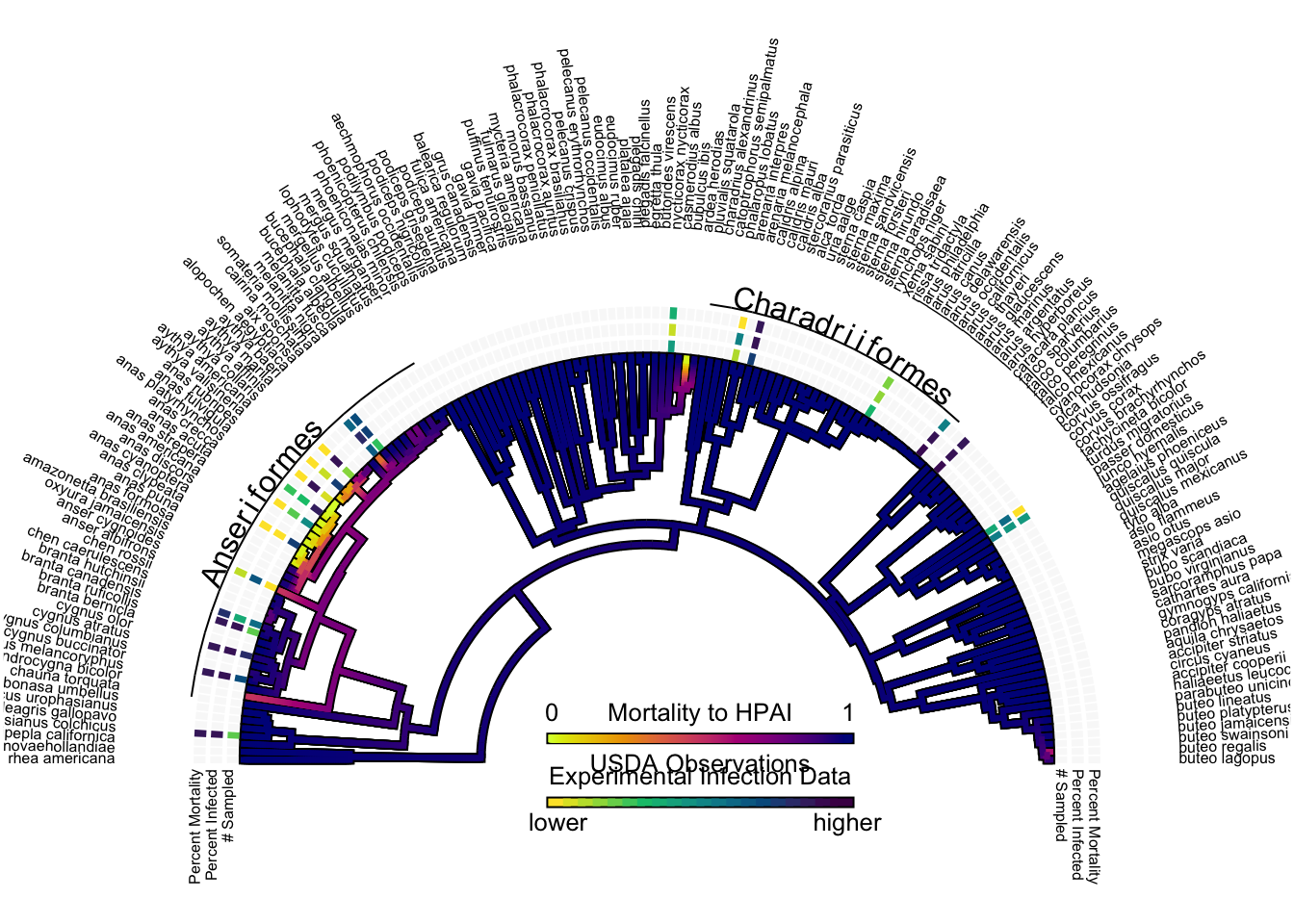
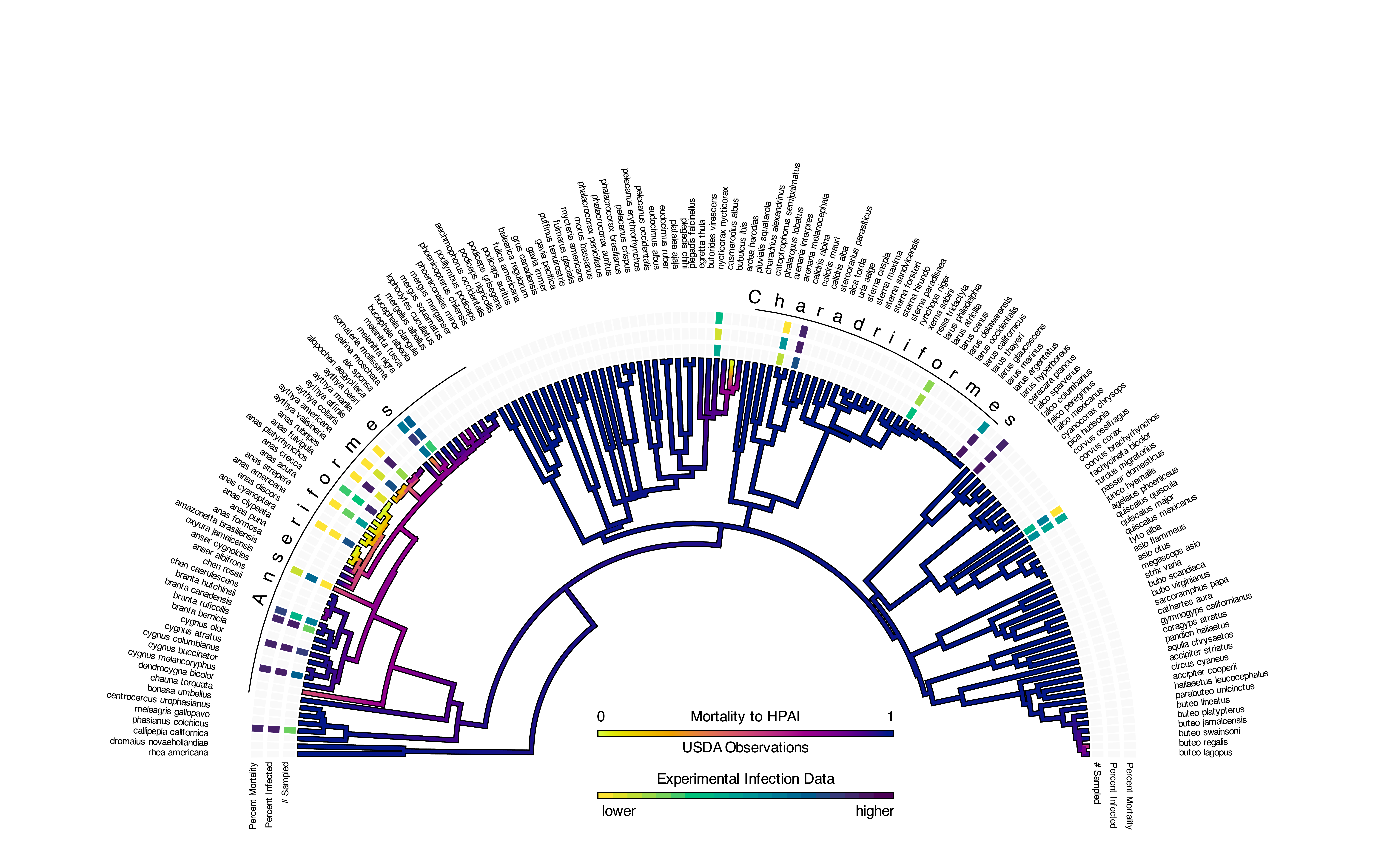
I took the liberty of adding in some labels so you know what each trait on the tips of the tree is. It looks a little squished but we are going to fix that outside of R using adobe illustrator so we can also remove any rastering that happens in the image itself.
The Final Plot:
Alright I am back from the world of Adobe Illustrator, with a beautiful plot for you.
I think that looks pretty nifty but what does it tell us you might ask? Well for the actual tree nothing has changed. We still see high mortality widely spread across the avian tree. Low mortality to HPAI is largely restricted to members of the order Anseriformes and the family Anatidae more specifically.
The experimental infection data however on the tips of the tree offers some additional and interesting insights. Let’s start with the ducks - anatidae - because they are glaringly obvious in this plot. For the most part it looks like there has been a large number of experimental infected ducks - based on the darker colors in the sample size trait box. At the same time they are still experiencing low mortality to HPAI, which is very cool to see both the USDA observational data and the lab data supporting this idea that ducks are surviving infection. It is also worth noting that while they are experiencing lower morality they are still getting infected with HPAI during these experiments and are PCR positive for HPAI.
As for the rest of the tree it is more of a mixed bag. In the species with high sample size that are outside of ducks we are seeing high mortality, consistent with our tree. Interestingly gulls exhibit both high mortality and lower mortality based on the species. While this could be an artifact of lower sample size it I have seen a similar pattern in the field. Some gulls get infected and die, while others can recover provided they have supportive care.
As with the prior blog post this plot is great for generating new hypothesis and looking at large scale trends but it does not give us much in the way of mechanisms nor does it incorporate any information from the viral side of this dynamic. As you are reading this I am working on a phylodynamic - a way to evaluate the ecological context with which a phylogenetic tree is “born” - that will give much deeper insights into transmission of virus between birds as well as favored hosts of the virus.
Stay tuned but untill next time keep your eyes to the sky.
Cheers,
Jonathan Dain
References:
Gonnerman, Matthew, Christina Leyson, Jeffery D. Sullivan, Mary J. Pantin-Jackwood, Erica Spackman, Jennifer M. Mullinax, and Diann J. Proser. n.d. “A Systematic Review of Laboratory Investigations into the Pathogenesis of Avian Influenza Viruses in Wild Avifauna of North America.”https://doi.org/10.1101/2024.05.06.592734.
 I think that looks pretty nifty but what does it tell us you might ask? Well for the actual tree nothing has changed. We still see high mortality widely spread across the avian tree. Low mortality to HPAI is largely restricted to members of the order Anseriformes and the family Anatidae more specifically.